

A Sleek, Modern Look Ushers In a New Era for the Tech Giant.
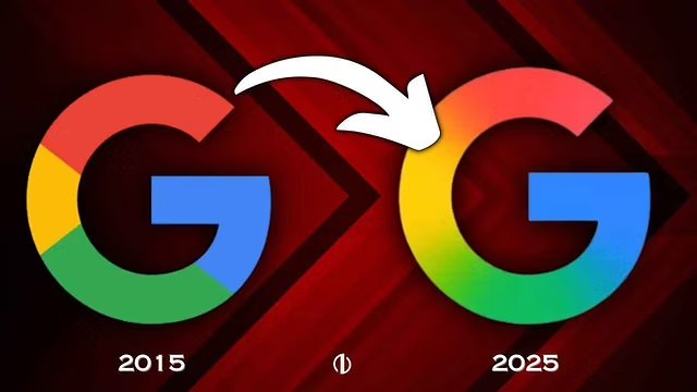
After nearly 10 years, Google has finally given its iconic logo a fresh makeover — and it’s got the internet buzzing. 🚀 The new design introduces a bold gradient twist, marking a significant evolution from the classic flat colors we’ve come to know and recognize instantly.
🆕 What’s Changed?
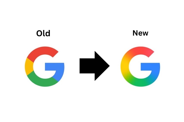
The new Google logo still features its signature blue, red, yellow, and green palette, but this time, the colors flow into each other with smooth, modern gradients 🌈 — creating a more dynamic and dimensional feel.
🔍 Here’s what stands out:
- Soft color transitions instead of flat tones
- A more refined “G” icon for apps and favicons
- Subtle shadows and curves that reflect UI design trends in Android and Chrome OS
- Better visibility across dark mode and adaptive screens 🌙🖥️
🧠 Why the Change?
In a world where user interfaces are becoming more adaptive and responsive, Google says the redesign was meant to reflect “fluidity, versatility, and motion” — aligning with their design system, Material You.
“We wanted the logo to feel alive — adaptable yet familiar,” said one of Google’s lead designers.
This isn’t just a surface-level refresh — it’s a statement about Google’s future direction in AI, UX design, and cross-platform branding.
💬 Community Reactions
The reactions are already pouring in:
- “It’s subtle, but somehow… fresh.” 🌬️
- “Feels like the Google of the AI era.” 🤖
- “Gradient = Growth. I see what you did there.” 🔥
Social media has exploded with side-by-side comparisons, fan recreations, and memes — proving that even the tiniest tweaks from tech giants don’t go unnoticed.
🖼️ What It Means for Users
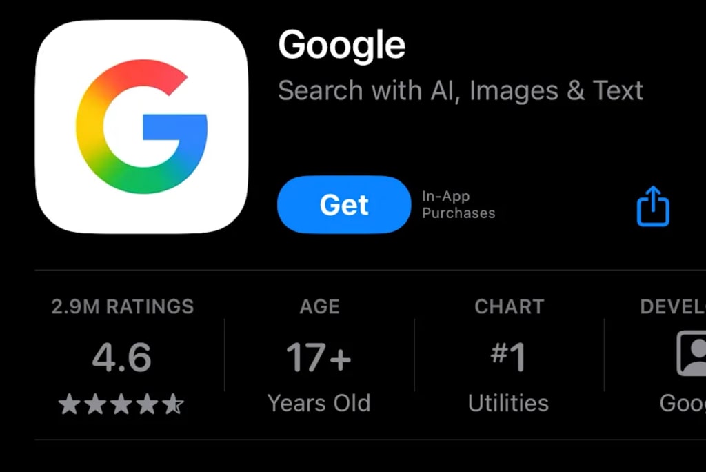
You’ll start seeing the new Google logo roll out across all major products:
✔️ Google Search
✔️ Gmail
✔️ Chrome
✔️ Android Apps
✔️ Smart Devices
And yes — the Google Doodles will adapt to the new gradient style too! 🎨
✅ Final Thoughts
In a world where visual identity means everything, Google’s subtle yet strategic gradient redesign signals a new chapter — one that’s more fluid, intelligent, and visually connected than ever. 🌐✨
Whether you love it or miss the classic flat logo, one thing’s for sure: Google just reminded us how powerful design really is.